Google’s social network Google+ has been given a bit of a facelift, moving away from the linear stream to a more progressive multi-column layout. Google senior vice-president Vic Gundotra said there are now 190m active users on Google+.
It is quite clear that Google is moving to consolidate the sheer volume of users spread across its different properties into the Google+ world and doing so would certainly up the ante against Facebook.
“Consider: 190m people are now active in the Google+ stream, and 390m are active across Google (+1’ing apps in Google Play, making video calls in Gmail, sharing videos from YouTube …) It’s a community of artists and astronauts and computer scientists and quilters – and it’s awesome. But we’ve only just begun,” Gundotra said on Google+ last night.
It is clear from some of the innovations revealed last night at the sixth annual I/O keynote by Google’s Android vice-president Hugo Barra that single sign-on APIs, such as Cloud Save, that have Google+ at their heart mean Google+ is central to Google’s strategy.
Cloud Save allows users to not only save their progress across smartphone, tablet and web devices, but also challenge friends to play games and interact in real-time across the Android, iOS and web platforms using their Google+ profiles as identifiers.
Yesterday, Chrome and Android VP Sundar Pichai revealed there are now 900m Android activations, 48bn Google Play downloads, and 750m monthly active users of the Chrome browser. It is clear Google wants to see the same success with Google+.
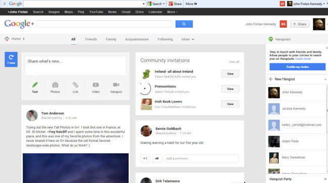
The redesign of Google+
Gundotra said the new Google+ will work seamlessly across the mobile, tablet and web interfaces.
Users will see one, two or three columns of content, depending on their preferences and activities.
Photos and videos will now fill the entire width of the stream and Hangouts appear to be given greater prominence to encourage users to use the videoconferencing platform more naturally.
A new Share Box on the upper let of the page encourages greater interaction, whether through text updates, photos, links, videos and Hangouts, so it is clear Google wants to drive more conversations on Google+.
The new design makes Google+ appear fresher and more relevant – the true test will be how effective it will be in growing the community in terms of simply keeping people hanging around.
One very vital ingredient is hashtags, and as part of the new update Google+ is adding in a related hashtags feature that will be ranked with conversations across the network and allow users to delve deeper into relevant content.
Gundotra also revealed a new standalone version of Hangouts that can be downloaded from Google Play, Apple’s App Store, and the Chrome Web Store, potentially upping the ante against Microsoft, which recently closed down MSN Messenger in favour of Skype, which it acquired last year for US$8.5bn.
The new Google+ layout