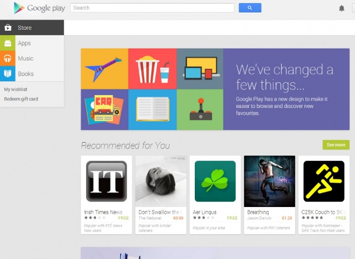
Screenshot of the new Google Play store
Visit Google Play via your web browser today and you’ll notice that the Android app store has had undergone an image overhaul to make it look more like the Google Play app.
The new mobile-friendly layout features a sidebar listing the categories available, as the app store also stocks music and e-books for Irish customers and other content like films and magazines in other markets.
Other uses have spotted a category called ‘Devices’, which offers content tailored to specific tablets or smartphones.
This sidebar also includes quick links to a user’s wish list and the option to redeem (or buy, in some markets) a gift card.
A drop-down menu across the top lets users filter by category or genre and each section has areas highlighting top charts and new releases.
The clean layout keeps the focus on the apps, and content with larger images accompany each item. Clicking through you get the usual user reviews and related apps.
Recommendations on the homepage will be personalised for users logged into their Google account and the front page will also highlight new releases and featured content.
Apple’s App Store celebrated its fifth birthday last week while Google Play, which started out as the Android Market in October 2008, is not far behind.