After 25 years with the same look, a makeover is surely due. Just in time for its autumn product releases, Microsoft is shedding its old image – not entirely, but enough to prompt some ‘oohs’ and ‘ahs’ – and emerging with a new, clean, modern logo.
Practically the entire Microsoft suite is being overhauled, so why not the brand itself. The new logo isn’t a grand departure from the old one, but it is a simpler design more suited to its upcoming releases and the UI-formerly-known-as-Metro.
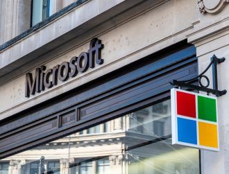
The idea is to completely refresh the brand for a new era, with a common look and feel across all its products and services. The font of choice, Segoe, is the same font used in Microsoft’s products and its marketing communications, while the symbol represents a world of digital motion, with squares of colour meant to reflect the company’s diverse portfolio.