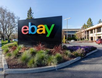
eBay's new logo
E-commerce giant eBay has refreshed its logo after 17 years with a slimmer and more modern look.
The new logo has the letters in the word eBay lined up evenly now, but the logo still contains the same colour scheme as the old branding.
“Our refreshed logo is rooted in our proud history and reflects a dynamic future,” eBay president Devin Wenig said in a statement.
“It’s eBay today: a global online marketplace that offers a cleaner, more contemporary and consistent experience, with innovation that makes buying and selling easier and more enjoyable. We retained core elements of our logo, including our iconic colour palette. Our vibrant eBay colours and touching letters represent our connected and diverse eBay community – more than 100m active users and 25m sellers globally and growing.”
Wenig added that “the time felt right” to redesign the logo, evolving just like the site has since 1995.
![]()
The previous eBay logo