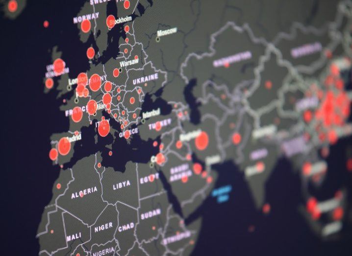
Image: © zest_marina/Stock.adobe.com
The sheer amount of Covid-19 data can be overwhelming to researchers and the public, but mapping has helped draw some clarity.
A picture is supposedly worth a thousand words, but in some cases a map can be priceless. If you’re a fan of all things cartographic, you’ll no doubt be familiar with the power a map can have in telling a story about a particular region or country.
So when the Covid-19 pandemic began to spread globally and people were clambering for the latest information, maps of all shapes and sizes quickly helped play a part. While raw data on case numbers from across a country can give you the information you need, a map showing where exactly those people are based – or where the greatest rates of recovery have been – can help piece together information you might not have seen otherwise.
In April, digital mapping firm Esri Ireland helped set up an interactive online dashboard charting the number of Covid-19 cases and deaths, county by county. It also broke down the number of cases resulting in hospitalisation, age distribution and many other important data points that would no doubt interest researchers and the general public alike.
According to Esri Ireland’s CTO, Eamonn Doyle, the map has captivated a large audience, generating more than 750,000 hits since 18 March on desktop alone, as well as more than 650,000 hits on mobile devices.
It proved to be a national effort, with Esri Ireland working with Ordnance Survey Ireland, the Central Statistics Office and the All-Ireland Research Observatory based at Maynooth University. Built on the GeoHive platform, Doyle said that putting this platform together was a huge challenge in the beginning as the available Covid-19 data didn’t exist in a way that could be easily implemented into the dashboard.
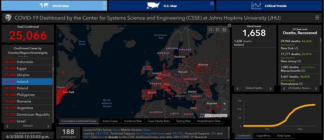
The John Hopkins Covid-19 dashboard. Image: John Hopkins University
A challenging start
“Initially when the dashboard was put together, it was done manually,” Doyle said. “But that was obviously unsustainable, so we put quite a lot of work into developing Python scripts that would source data from the relevant sources [the HSE and the Health Protection Surveillance Centre] and then pushed it into our cloud-based platform.”
Ireland is not the only country using Esri’s technology to visualise Covid-19 data. Across the Atlantic Ocean, a very similar-looking dashboard is being used to track the number of Covid-19 cases globally, attracting daily visitor numbers that some of the world’s most popular websites could only dream of.
The reason it looks so familiar is because the dashboard developed by John Hopkins University was built using Esri’s ArcGIS platform, which is designed to help visualise big data into a series of maps and dashboards.

Esri Ireland CTO, Eamonn Doyle. Image: Esri Ireland
According to Doyle, the John Hopkins dashboard quickly became the go-to source for Covid-19 visualisations, clocking in a staggering 1.2bn hits per day. Perhaps unsurprisingly, Lauren Gardner, who led the university’s dashboard development, said in an April interview that it has been a monumental effort to keep it updated with new data every hour.
Being just a small team, the researchers had to work with Esri to scale up the dashboard to handle such demand.
“We had to quickly act to increase capacity and availability on our cloud to sustain the level of hits that that dashboard is now getting,” Doyle said.
“[The researchers] also scripted a lot of the sourcing of the information from scraping web sources or accessing sources from the World Health Organization or from a country’s own portal, including Ireland.”
Just the tip of the iceberg
However, Doyle added that these dashboards are just the tip of the iceberg for how the company’s tools are being used to visualise the Covid-19 pandemic, at least when it comes to Ireland.
“We built the public-facing dashboard,” he said. “But there’s a much bigger set of dashboards that the public don’t see.
“These are used by the Department of Health, the chief medical officer and others to keep track of what’s going on [with Covid-19 in Ireland] in much more detailed information and from a wider variety of information sources.”
Other collaborative efforts have included working with An Garda Síochána to use GeoHive to create a dashboard to track the volume of traffic on Ireland’s roads during the pandemic.
“We also got involved with community groups and voluntary organisations that were coming together to respond to people’s needs during lockdown,” Doyle said.
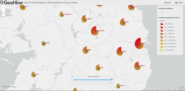
Mapping Covid-19 in Ireland. Image: Esri Ireland
“For people cocooning or who were isolated, they were able to call up their local authority and they’d be put through to a call centre. Those centres would have our maps and the call-taker could identify the nearest supermarket to get groceries to those people.”
I’ve always loved maps as a tool for learning about the world around me, both local and global. So, for me, tracking the spread of Covid-19 has played a huge part in my understanding of its place in the world, highlighting where has been hurt the most by this humanitarian disaster and what we could possibly learn from how it spread.
Perhaps unsurprisingly given his line of work, Doyle is in agreement.
“The Covid-19 pandemic and the issues around mapping it have been very fruitful because it’s been instantly able to reveal patterns, trends and trajectories that otherwise wouldn’t be possible if you weren’t using maps,” he said
“When you put a map in front of someone, it becomes personal, almost instantly.”