Today's iPod touch family
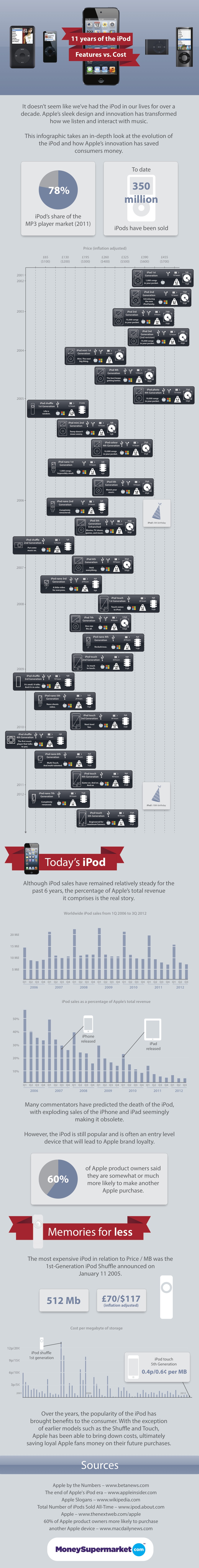
Apple’s introduction of the iPod in October 2001 pretty much signalled the death of portable disc players and changed the way consumers listen to music on the go. Since then, the iPod has evolved and a new infographic examines how the device has changed through the years and how it has saved consumers money.
The infographic by MoneySupermarket depicts each generation of iPods and its features, from the first-generation iPod that placed 1,000 songs in consumers’ pockets, to the fifth-generation iPod touch, ‘engineered for maximum funness’.
The infographic also looks at worldwide iPod sales from the first quarter of 2006 to the third quarter of 2012, revealing they have remained more or less steady during that time period, and offers an answer to the question of whether the iPhone and iPad will kill off the iPod.