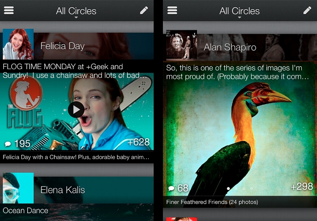
Google+ focuses on iOS first for its smartphone app upgrade, which is heavily centred on visual quality and makes sharing easier with a static +1 button.
“We’re not interested in a mobile or social experience that’s just smaller,” wrote senior vice-president Vic Gundotra on the official Google blog yesterday. “We’re embracing the sensor-rich smartphone (with its touchable screen and high-density display), and transforming Google+ into something more intimate, and more expressive.”
All of this ties in with Google’s plan to make its social network simpler and more aesthetically pleasing. Just last month, an upgraded look-and-feel was rolled out to the website, featuring a navigation ribbon equipped for drag-and-drop customisation, an upgraded stream that makes it easier to scan conversations, and a lot more space for images and video.
An immersive, image-led interface
The iPhone upgrade takes up where the web update left off. The app has been completely redesigned to focus on the visual, tapping into the see-and-share nature of social media.
Individual posts now take up most of the screen and, if there’s any imagery or other media attached, this gets practically a full-screen view. Accompanying text is overlaid on the image (saving on space and keeping everything very visual), while a quick tap takes you to the full view of the post, with the image on top and the bottom half of the screen taken up with comments. Shared photo galleries also make use of these full-bleed photos, and you can swipe to view all images in a gallery directly from your stream.

The grid layout of the home screen has been scrapped in favour of a ‘friendlier’ vertical list of Google+ sections, and, when viewing posts, the +1 button has been fixed to the top right of the screen, making it easier for you to give kudos and push content out on your own stream.
Performance has also been improved to make the in-app user experience more fast and fluid, and scanning an image-rich stream easy for the eye handle. Conversations fade into view as you move backward and forward, while overlays, gradients and other optical cues help you to discern content at a glance.

Overview
Overall, the grey and black colour scheme, simplified buttons, crisper fonts, larger profile pics and striking visuals of the new Google+ iPhone app are greatly pleasing on the eye, but this rich layering of content can be a bit of a drag on a slow connection.
While, ironically for a Google product, Android users will have to wait for their upgrade, Google has promised a few extra surprises for them, so watch this space!
Google+ for iPhone version 2.0.0.5888 (no, really) is available in the App Store now.