To make it easier to avoid sites that require adjusting the screen size on a mobile device, Google will now put a tag in its search results that tells users whether or not a site is mobile friendly.
To ease a user’s frustration at finding a site that contains small text or text that requires the user to scroll across a device’s screen, Google has confirmed the tags will begin rolling out to mobile users over the next few weeks.
Whether a website is compatible with a mobile browser will be indicated with the ‘mobile-friendly’ tag included in the Google search result just below the web link.
However, in order for a website to be deemed mobile friendly, it must meet a number of criteria. These include software that is not common on mobile devices, such as Flash, uses text that is readable without the need for zooming, sizes content to the screen so users don’t have to scroll horizontally across their devices, and places links far enough apart so the correct one can be easily tapped.
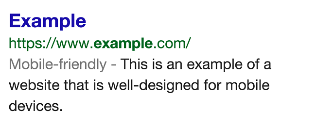
How the ‘mobile-friendly’ tag will appear on a Google search results page. Image via Google
The blog post explaining the new tag, written by Ryoichi Imaizumi and Doantam Phan, of Google’s Mobile Search division, has effectively lit a fire underneath developers of mobile unfriendly websites, as it could negatively impact the sites’ Google ranking.
“We see these labels as a first step in helping mobile users to have a better mobile web experience. We are also experimenting with using the mobile-friendly criteria as a ranking signal,” read the blog post.
Google has also released a webpage for web developers to see whether their website is considered mobile friendly and if not, what exactly the reasons are for it not meeting the criteria.
Mobile web design image via Shutterstock