
Data visualisation — or datavis for short — once considered as nothing more than slideshows of pie charts, is now a booming industry in its own right as more and more organisations look to turn reams of data into useable information.
Of course, datavis has been around a lot longer than what we would consider datavis today.
Datavis has existed since humans first developed more complex navigational equipment and began exploring distant lands thousands of years ago, taking raw data in the form of geographical information and landmarks, and turning that into an easily readable representation of it — maps.
This, in essence, is what datavis is today for the thousands of companies using it on a daily basis.
Rather than filling out details by hand like the ancient cartographers, huge servers now store vast amounts of information generated across nearly all sectors of business and research.
Taking the example of a company that produces a wearable device, the vast amounts of data generated by thousands of users who have their devices connected to their phone and online can tell them user preferences.
With all of this data collated, it can then be entered into a datavis platform that will take what is essentially meaningless data and turn it into recognisable statistics and patterns such as, say, a graph with a time that its users are using their device most, on average.
This would be rather important given that recent estimates put the number of wearable devices that will be connected online in the region of 25bn by 2020.
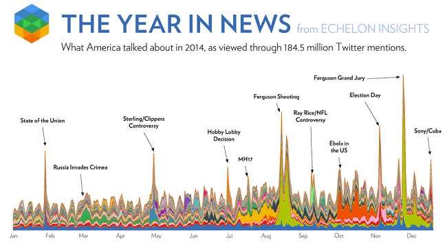
Echelon Insights shows 2014 in the news on Twitter. Image via Echelon Insights
Information slipping away
Even when companies start to take advantage of datavis capabilities, the reality is that it is just the tip of the iceberg when it comes to the amount of data we’re actually turning into usable and visible trend analytics.
Earlier this year Cisco predicted that 2015 would be the ‘year of the zettabyte’ with 1zb (1bn terabytes) of data generated online.
A separate IDC report found that of this vast amounts of data, approximately 23pc could be analysed and used to benefit a company.
Incredibly, however, only 3pc of the world’s data is actually captured and even more incredible is that only 0.5pc of that is analysed.
When you put that into perspective, that means most of this 0.5pc isn’t even being entered into datavis programs to turn it into useful information.
Speaking during a TED talk about datavis, data scientist and journalist David McCandless perhaps best described what this new technology offers companies.
“I would say that data is the new soil,” he said. “Over the years, online, we’ve laid down a huge amount of information and data, and we irrigate it with networks and connectivity, and it’s been worked and tilled by unpaid workers and governments… But it’s a really fertile medium, and it feels like visualisations, infographics, data visualisations, they feel like flowers blooming from this medium.”
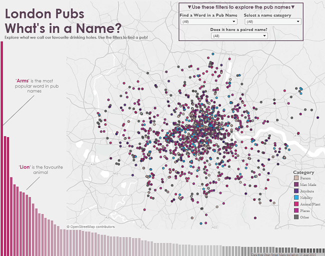
Image of Tableau datavis via Tableau Public. Click for interactive graph
The big players
Tableau is one of the companies that has been at the forefront of riding the datavis curve, having been valued at US$6bn at the beginning of the year, and it has begun opening offices abroad, most noticeably here in Ireland.
Last September, the company created another 100 jobs to facilitate its clients who are calling out for their data to be put into easily readable and shareable charts, maps and graphs.
Taking some recent examples, the Rugby World Cup, which is underway at the time of writing, is an absolute treasure trove of sports data looking at each of the participating nations.
Speaking last year, one of Tableau’s leading voices spoke about the importance of datavis, with their VP of EMEA, James Eiloart, highlighting how not just their own platform, but all datavis, is a means of democratising data.
“The pressing need to understand and act upon data quickly means everyone will have to become comfortable handling data. We all need to become a data specialist – no matter our current position or field of expertise.”
For that reason, companies like Tableau are beginning to roll out freemium versions of its software, which can allow those without data science backgrounds to take their excel sheets or other data files and apply them to a datavis field.
Not just graphs and maps
This all needs research and development, though, in order for it to be as simplified as possible for anyone to use, which is seeing the creation of a number of roles in datavis companies for leading academic data researchers.
Speaking with Siliconrepublic.com, Eiloart said of Tableau’s focus: “Tableau invests substantial amounts in R&D… That area of building a beautiful UI [user interface] that is highly intuitive is always right at the top of our list of priority development areas.”
Of course, it’s not all about analysing vast data sets and creating graphs and maps, sometimes it’s about taking a small amount of data, like that which would be found in a report, and just making it easier to digest using artistic styling.
For example, the Irish company Think Visual is an example whereby the contents of a talk at a convention can be creatively and effectively summarised by a team of artists who are there on the day or with a recording.
Their work with Siliconrepublic.com saw them take the words of Intel’s VP of IoT, Philip Moynagh, talking about the technology and turn it into an easier-to-understand cartoon format.
So go on, why not try one of the 55 datavis tools that are currently online, there’s very little excuse not to try it out for whatever use!
Siliconrepublic.com’s Data Science Week brings you special coverage of this rapidly growing field from 28 September to 2 October 2015. Don’t miss an entry worth your analysis by subscribing to our news alerts or following @siliconrepublic and the hashtag #DataScienceWeek on Twitter.
Datavis on tablet image via Shutterstock