
Aintree plays host to the English Grand National this weekend, so how about using a bit of data visualisation to choose a winner?
Armchair sports fans have more information on their favourite players, runners and riders than ever before, with big data finding its way into top level sport at an impressive rate in recent years.
Last summer, the Tour de France embraced this datavis world big time, trialling out an online viewing platform that’s beauty lay in its immediacy. Tracking Nicholas Roche in real time, monitoring the breakaway groups and keeping up to date with the convoluted points system, Dimension Data’s first foray into cycling was rocky, but achieved its goal of opening up information to the masses.
Other companies are involved in this type of carry on too, like Tableau, which showed off its nice – if limited – Rugby World Cup tool last October. The interactive site, which was basically a 2015 version of a 1995 newspaper pullout wall chart, had a new layer of info for enthusiasts.
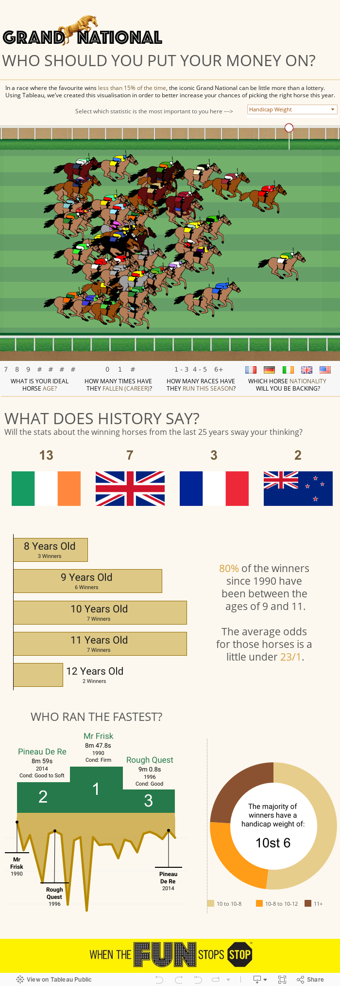
At the time, we mentioned that the likes of Tableau would be refining user-facing gadgets like this in the future and the company is at it again, this time with a nice, retro-looking interactive infographic with details on this weekend’s English Grand National.
The visualisation contains certain filters, so you can pick your horse depending on age, career background, nationality, its handicap weight etc. It also presents a look back in history on who ranked the top and why (age, nationality, weight).
Horse racing image via Dziurek/Shutterstock