There’s a danger within the education of people about war that, given scale and large, rounded numbers, we lose context. But this video can change all of that with regards to World War II.
This incredible 15-minute masterpiece clearly shows the numbers of people who lost their lives between 1939 and 1945, including when, where and to what end they died.
Now 15 minutes may sound like a long time but, trust me, this video is something you really should see, especially if World War II is something that interests you.
Starting out by looking at American deaths in the war – separated between Pacific and European ‘theatres’ – ‘The Fallen of World War II’ takes the watcher on a harrowing trip through interactive bar charts, showcasing scale in a brilliant way.
“The numbers are staggering,” explains Niall Halloran in the video, delving into the horrifying total losses of the Soviet Union, the fact that as many German soldiers died in Stalingrad as in the entire Western Front, and the surprisingly (for me) large number of deaths suffered by the Chinese in particular.
Towards the end we’re shown how everything has changed since the most destructive war in history — World War II. Combining every war since, it still can’t topple the total losses served up in just a six-year spell.
It’s a remarkable video, and the complementary – and interactive – website only adds to it.
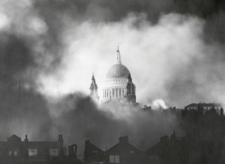
St Paul’s Cathedral, London during WW2 image, via Shutterstock