Facebook. Image: JaysonPhotography/Shutterstock
Facebook has announced some design changes to be rolled out across users’ News Feeds on the app and website.
The design of social networking behemoth Facebook has undergone plenty of alterations since its foundation back in 2004, from allowing users to ‘like’ posts in 2009 to the introduction of the Timeline in 2011.
This time around, the changes were focused on making the average user’s feed easier to read, with layout changes to encourage a more conversational experience.
Product design manager Shali Nguyen and design director Ryan Freitas explained the logic behind the revamp: “Every person’s News Feed is different and populated with a unique set of stories; from photos and videos, to GIFs and links. And, with so many types of stories available, each feed is more complex than ever.”
Following in the footsteps of Twitter, circular profile pictures have replaced square ones, a change that most people will spot first.
Other tweaks are less obvious, such as the change in comment style, which makes it simpler to see which are direct replies to another user. The new comment design echoes the interface of the Facebook Messenger app, with grey message bubbles.
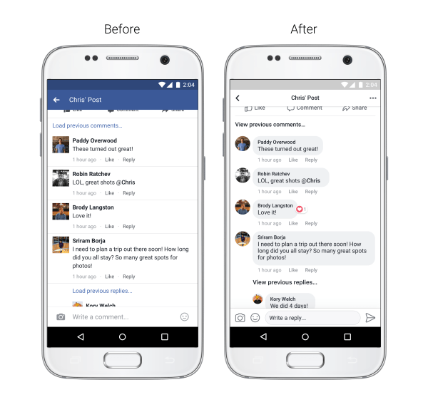
Redesigned comment threads and circular profile pictures. Image: Facebook
Efforts have been made to improve the readability of the site, including increased colour contrast and larger link previews.
The Like, Comment, and Share buttons have been enlarged, making them easier to tap.
The company has also reduced the amount of iconic Facebook blue accents throughout the app and website.
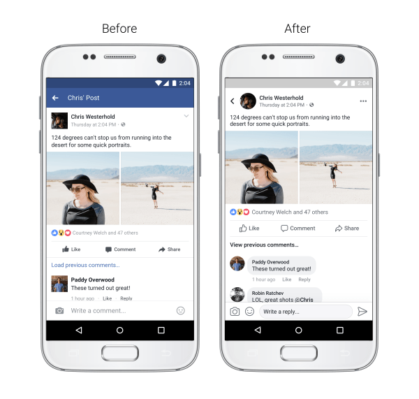
New app design – less blue, bigger buttons. Image: Facebook
Facebook. Image: JaysonPhotography/Shutterstock