
GIF. Image: Rawpixel.com/Shutterstock
Google’s new aide for journalists and storytellers is the Data GIF Maker, but its ease of use is matched by a sluggish, interminable wait for a conclusion.
Google’s quirky tools are forever growing in number, with the company clearly one of the more ambitious in the digital world.
Its search engine, mapping technology and translation tools are bona fide gems. However, not everything works.
Google Plus, for example, was a bit of a disaster. Most people were using various Google tools, so the company thought a rebrand and an umbrella term would help. It didn’t.
Its new product, Data GIF maker, falls somewhere in between these extremes. Or rather, it will, when it starts working a bit better.
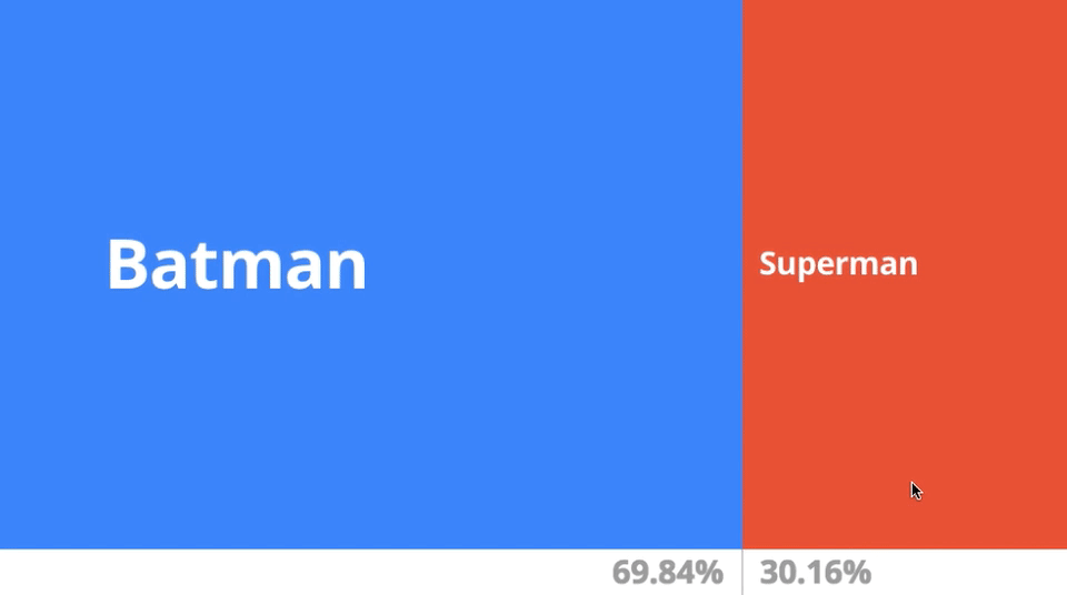
Creating data GIFs, it’s aimed at journalists, bloggers and general storytellers as a way to spice up data, enhance articles and bring simple text to a better level.

GIF: Google
“Data visualisations are an essential storytelling tool in journalism, and though they are often intricate, they don’t have to be complex,” said Google.
“In fact, with the growth of mobile devices as a primary method of consuming news, data visualisations can be simple images formatted for the device they appear on.
“We typically use the tool to represent competing search interest, but it can show whatever you want it to – polling numbers, sales figures, movie ratings etc.”
It has provided examples, which are nice, and it’s probable that these types of GIFs will appear in multiple new stories covering elections in the coming months.
GIF: Google
To get started, you pick your two topics, enter your data in a comma-separated list, write a few words to explain what the data represents and you’re done.
You can change colours if you want, and then just click ‘download as GIF’.
In theory, what happens next is that your download folder is populated with a handy tool. Sadly, though, it takes an age to process.
If you would rather just look at the comparisons, rather than download, you can click ‘launch comparisons’. However, that doesn’t even seem to work at the moment.
Enhancing the presentation of data is a great idea. The execution at this stage, though, is lacking.