By now the most ardent of Apple fans will have updated their iPhone, iPad, and iPod touch devices with the new iOS 7 operating system. Is it what you expected?
I wasn’t sure what I was expecting but like many longtime users of the iPhone I felt the appearance of the iOS was long due an overhaul. To my mind, outside of the introduction of folders for managing apps five or so years back, very little had changed.
iOS 7 is what occurs when you take the design genius of someone like Sir Jony Ive – associated with the design of hardware like the iPod, iPhone and various Macs – and apply it to software.
‘Flat’ design was coming in and the three-dimensional iconography that dominated the iOS environment to date was being ushered out. In fact, Apple may owe Microsoft a debt of gratitude on this front, since it was Microsoft that brought in flat design with Windows Phone and it has caught on.
We were also expecting a riot … no, make it a confection … of different colours and the first rushes we saw of how the new OS would turn out suggested lots of pastels.
So, while I was eager to see how it turned out I was no doubt a little nervous.
It took me about a dozen attempts to download the new OS and the download itself took a number of hours before I could activate it.
Security and appearance
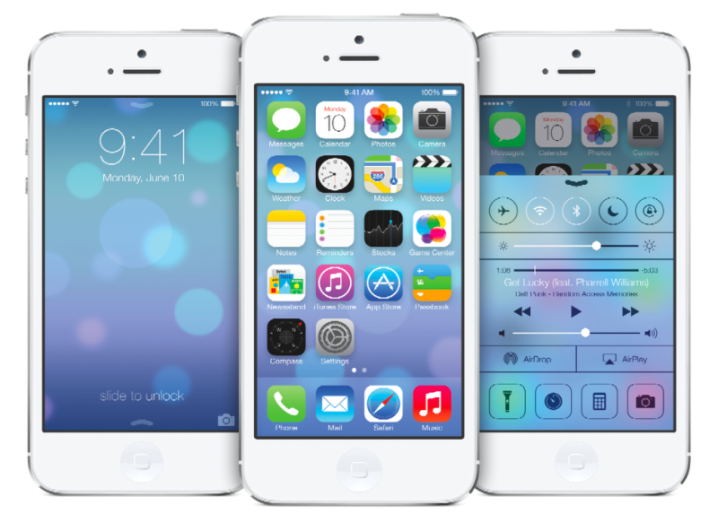
The first thing you notice is the different use of sans serif fonts, larger and clearer and like everyone else – since the iPhone 5s with its fingerprint security isn’t out until Friday – the first discovery was Apple ushering people in the direction of putting in a four-digit PIN if they didn’t already have one.
You’re then taken through a quick tutorial on the new gesture controls. Instead of swiping from the left you are shown how to begin a Spotlight search for everything – including apps, contacts, emails, and so on – by simply swiping down on the main screen.
You can still get Notification Center by swiping down from the top of the screen.
My fears about my eyes burning from a blaze of colour were unfounded, the app logos appear brighter on the screen, but definitely cleaner, too. Everything just seems fresher.
The structure of text on the page again appears fresher and brighter, thanks to a larger use of sans-serif fonts. This change is particularly obvious in apps like Mail, Reminders and Weather.
The new design also looks pretty remarkable in the Calendar function. Apple has certainly done a clean-up job on the OS and the results are stunning.
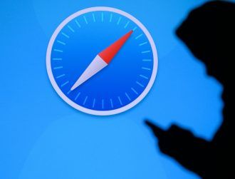
Safari gets a facelift

Since many smartphone users spend a lot of time surfing the net, I was pleased to see some amazing changes in Safari. You now get full-page display of web pages.
Multiple page views have been craftily changed to allow you to scroll through various pages up and down with your thumb rather than swiping from left to right.
If you want to get rid of a page from your selection just swipe the page away to the left.
Safari also comes with a new Private browsing function that also allows you to clear all the pages you had been viewing.
Camera and Photos
Perhaps the most interesting changes – to me, at least – are on the Camera and Photos front.
Firstly, Apple has introduced a new way of managing your photos that is both beautiful and timely. You can now organise your photos by the year and see them in miniature swarms and also by the location where they were taken and more.
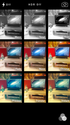
The Camera has been revamped and takes on the appearance of a traditional negative frame on a photo. Just above the capture button you can slide between options of whether you want to take a photo, shoot a video, capture a panorama or square your shot.
On the lower right of the screen is a new feature that lets you choose between nine fairly swish filters.
Convenient new touches
Apple has added some nice new touches that effectively make the iOS devices much easier to use. For example, whatever app you happen to be in by just swiping upwards, the new Control Panel appears, giving you handy access to necessities like Airplane Mode, Wi-Fi, Bluetooth, Brightness, and more.
Another nifty new feature is a built-in digital version of a spirit level, which you can find in the Compass app by just swiping the screen left.
Verdict
iOS 7 feels like the most ambitious rendition of iOS since Apple began on its mobile journey in 2007 but really what it is, however, is a new coat of paint with a few flourishes in terms of gestures and control.
In terms of structure, not a whole lot has changed, except maybe on the Safari and Photos front, so longtime iPhone or iPad users will get up to speed pretty quickly and the gestures are quite instinctive.
Many of the features we’ve come to expect in the latest Mac products – including Notification Center, AirDrop and Multitasking, can now be found on the iOS platform.
What’s revolutionary here is the gap that is closing between iOS and Mac and eventually it will get to a point where ultimately there will be no difference.
Appearance-wise, it’s the most ambitious thing Apple has done with iOS and long overdue.
But is it revolutionary? Only time will tell and that will depend on what developers who’ve had access to the OS for months now will conjure up for the App Store.
All in all, a fine achievement by Apple.