
View an amazing visualisation of the network of all the world's airports and how they are connected by region
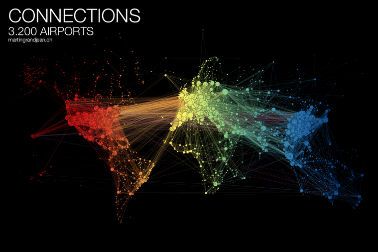
All the world’s airports form part of a global network of almost 3,300 sites linking some 60,000 routes – an ever-moving mesh of people and machines.
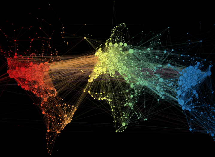
Swiss data visualisation designer and programmer Martin Grandjean has produced a mesmerising map that visualises the complex network through which millions of humans get around our planet.
“A network, in its very essence, is already a map,” wrote Grandjean. “And the global transportation maps that represent the flight connections rarely make this network intelligible: on a world map, Europe is often a very dense area where it’s almost impossible to distinguish the dots/airports.”
“Ultimately, these maps (sometimes very beautiful objects), do not represent the data itself, but some idea of the complexity and quantity.”
Grandjean’s map is the result of the application of a “force directed” layout algorithm on a graph of 3,275 airports that amount to 37,153 single routes based on OpenFlights.org data.
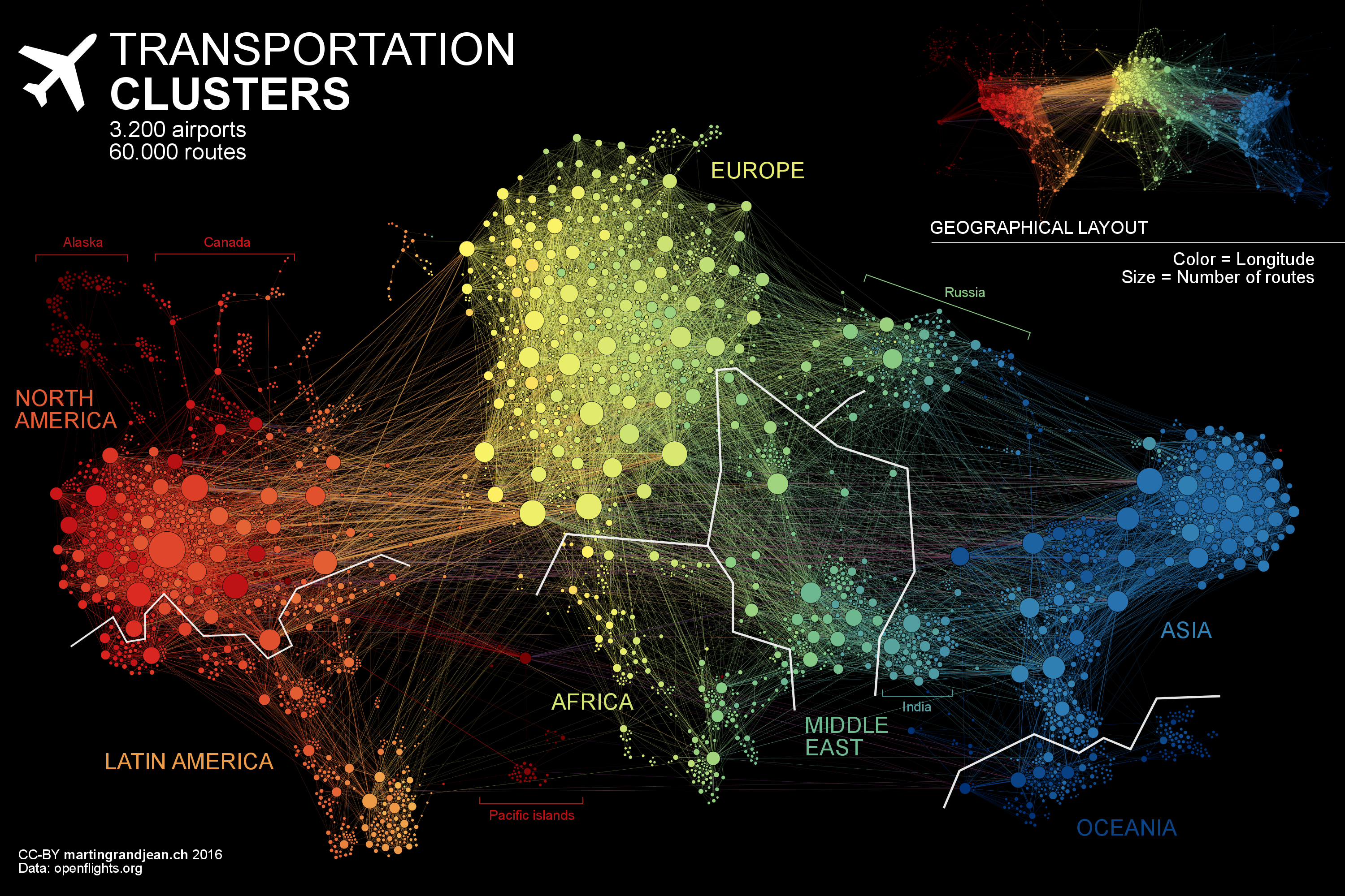
Grandjean wrote on his site: “Naturally, network geography is not completely disrupted: the continents are mostly visible and regions are generally in their original position (with the exception of the Pacific islands that connect Asia and America – imagine this graph in three dimensions, with the Pacific Ocean behind).
Additional major observations from Grandjean include: “India is more connected to the Middle East than to South and East Asia. The Russian cluster is very visible, connecting airports in Russia but also in many former Soviet republics. Latin America is clearly divided between a South cluster and a Central American cluster very connected with the US.”


