The iPhone 5 (left) and the Samsung Galaxy S III, and Android phone
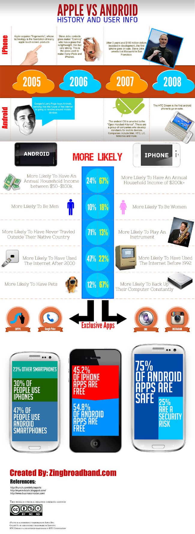
A brief history of iPhone, with its iOS operating system, and Android, and the differences between users of both are the subjects of a new infographic.
The infographic by Zingbroadband.com that’s published on Visual.ly charts key events in the evolution of the iPhone and Android between 2005 and 2008.
Beneath that are a smattering of facts about iPhone and Android users. For instance, iPhone users are more likely to have a higher annual household income than Android users, and more Android users tend to be men than women.
The infographic also gives a nod to apps that are exclusive to Android and iPhone, as well as presenting facts and figures about apps on the two operating systems.
