There’s an awful lot of content on the internet, but there are few things as hypnotising as when data visualisation (datavis) is presented live in front of your eyes.
Given that 2016 is supposed to be the ‘year of the zettabyte’, and that the years to come are going to get even more data-heavy, turning all of this information into datavis creations is a necessity if we’re to actually get our heads around it.
Typically, this has been seen with the curation of a number of different mediums, such as infographics, pie charts or graphs, but one of the most effective ways of getting your point across is when datavis is presented to you in real-time.
Not only does it help you keep you up-to-date on the latest information on a topic – say, the financial sector, online or the environment – but it can also put things quickly into perspective in a way that static datavis simply can’t.
A rapidly-ticking counter can be shocking or humbling, yet a slowly-moving counter can also elicit a similar response, depending on the topic.
So, with this in mind, here are just a few examples of when live datavis gets it right, and teaches you a few things about the wider world, too.
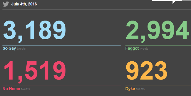
No Homophobes Dot Com
In case you haven’t noticed, homophobia is rampant on social media. Whether it’s targeted bullying against someone a person knows or just an attack on a well-known personality, there are plenty of tales of cyberbullying for no other reason than someone’s sexual orientation.
The problem has become so bad, in fact, that in France last May, a lawsuit was issued against Twitter, Facebook and YouTube by one organisation claiming they were failing to remove such content from their websites.
For this reason, and to highlight how casually hurtful words are thrown around on social media, the Institute for Sexual Minority Studies and Services (ISMSS) at the University of Alberta decided to create a live datavis site highlighting it in real-time.
Called No Homophobes Dot Com, the site tracks daily every instance on Twitter when someone uses a homophobic statement like ‘so gay’ or ‘no homo’ with a number beside each one.
All of the offensive tweets are then listed below to see in what context it was used.
Sadly, at the time of writing, there are thousands of tweets made in just one day where such phrases or words are used, putting the casual way they are thrown around into perspective.
Norse Attack Map
How many cyberattacks are happening right now as you read this? For the average person, it’s hard to tell, aside from when we hear about the latest major security breach from a social media site or established institution.
Looking at the live cyberattack map provided by the security firm Norse, it’s hard to comprehend the sheer amount of attacks happening globally at any given time.
Looking rather like a scene from the 1983 hit film, War Games, pings fly from one end of the world map to the other, telling us where one attack originates, and where its target is.
This also includes time stamps, IP addresses and what type of attack was instigated, giving you a wealth of information, although, if you’re trying to find an attack made against you, it’s highly unlikely, given the rapid pace of attacks.

Internet in real-time
This is quite self-explanatory, but one site charts how many posts go up on some of the biggest websites and services online at any given moment.
How many apps are downloaded from the Google Play Store every second? How many hours of Netflix are being watched right now?
These questions are answered right in front of you and it’s quite shocking to see the numbers tick by at an alarming rate.
Much of the data is generated based on these companies’ own statistics of the number of posts made daily, however, so it’s not going to be pinpoint accurate, but a fair measurement of real daily activity.

WindyTY
As someone who’s a fan of maps, this is one of my favourite datavis websites. It charts global weather patterns in real-time with a kaleidoscope of colours.
Aside from charting wind, it also charts rain and snow.
Coded and developed by Cameron Beccario, the map technology is based upon NMM Nonhydrostatic Meso-Scale Modelling (NMM) technology, which creates calculations based on ‘domains’ made up of large areas covering parts of or entire continents.
It can be as detailed as you want it to be, and it lets you become the amateur meteorologist you’ve always wanted to be.
Plus, you can make the live feed your actual desktop background, which makes it even better.
Listen to Wikipedia
And now for something completely different.
The online encyclopaedia, Wikipedia, is one of the most-visited sites on the web, with 10 edits made every second on every topic imaginable.
Programmers Mahmoud Hashemi and his friend Stephen LaPorte had a self-described “absurd” idea to turn each of these edits into an audible chime.
Made just for some fun, the page now just plays a random assortment of chimes, each of which shows what article has just been edited.
“We programmers by and large end up doing a lot of things because we can, not because we should,” Hashemi said in a previous interview.”
Bitbonkers – Live bitcoin tracker
The perception of bitcoin being the currency of illegal trade online is long gone, and in its place is a new decentralised currency with its blockchain technology rapidly being adopted by the established financial institutions.
It’s believed that, every hour, 8,000 bitcoin transactions occur online globally and now, with a little help from a site called Bitbonkers, we can now see these as they happen.
Once you enter the site, coloured balls – representing different amounts of bitcoin – will fall from the sky onto a square, each of which responds to real physics.
Aside from it raining multicoloured balls, you will also see enormous blocks dropping down as representations of, unsurprisingly, blocks within the blockchain.
The size and number of the block is determined by the number of bytes the blockchain is.

Datvis image via Shutterstock
Want stories like this and more direct to your inbox? Sign up for Tech Trends, Silicon Republic’s weekly digest of need-to-know tech news.