
Tableau is gradually releasing huge amounts of data into the wild, with its latest project a timely and detailed visualisation of the Rugby World Cup.
Modern sports supporting, across numerous disciplines, has recently become an exercise in trotting out statistics, learning averages and knowing more than your peers.
In the UK and Ireland it’s something that started in the mid-1990s with the dawn of Championship Manager, a computer game purely consisting of streams of numbers, cleverly wrapped up in a football façade.
That game caught on better than anyone could have imagined and pretty soon fans spoke of things like top speed, tackling and aggression attributes as if people actually walked around with giant 13/20 figures beaming above their heads.
Fantasy football soon followed, meaning now you hear of players’ assists as much as you do of goals. “I’m glad I captain’d Wes Hoolahan!” you might hear in the pub, suddenly aware that captain has now become a verb.
Now it’s rugby season
Rugby is slightly behind this curve in that, only turning professional 20 years ago, it’s had to play catch up.
However, it’s now at the forefront of most non-US sports when it comes to statistical measuring, especially among fans.
Now Tableau is making it easier for those with a hankering for additional information around the Rugby World Cup.
This cool interactive tool, which is basically a 2015 version of a 1995 newspaper pull-out wall chart, has it all.
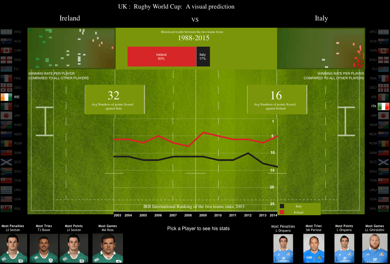
Tableau’s Ireland v Italy stats, click to view a larger image
Experts at data visualisation, we can probably expect a lot more of these types of tools appearing in the near future, as companies and enthusiasts try to make sense of the mounds of information available to us.
All 20 countries, their head-to-head records, top scorers, world ranking timelines and the likes are available to view.
There are even findings for the players with the best win rates over the past four years. For example, towards the bottom, Leonardo Sarto of Italy has won just 6pc of games since 2011. Towards the top, New Zealand’s Luke Romano is well over the 90pc mark.
It can answer questions like: Who has the most tries for Ireland since the last World Cup? And what English player can match him in that timeframe?
Take a look at the tool, you might learn something your mates don’t know.
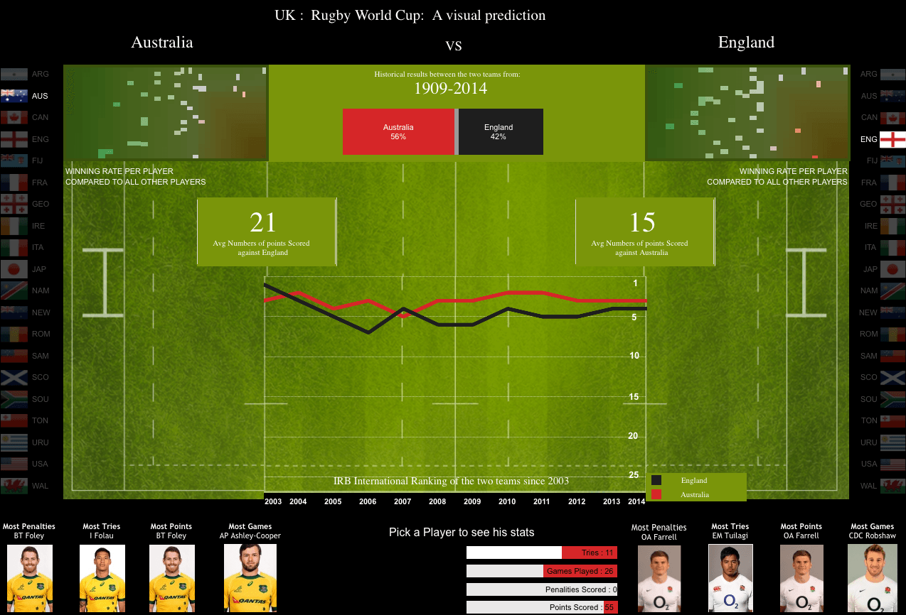
Tableau’s Australia v England stats, click to view larger
You can mess around with the tool on Tableau’s site, here.
Siliconrepublic.com’s Data Science Week brings you special coverage of this rapidly growing field from 28 September to 2 October 2015. Don’t miss an entry worth your analysis by subscribing to our news alerts or following @siliconrepublic and the hashtag #DataScienceWeek on Twitter.
Main image via Shutterstock